INDEX

You are considering getting a mobile application for your company. Nothing strange there: a lot of your competitors probably already have one, just as hundreds of thousands of other companies in the world.
When you are trying to find out who to reach out to for the development of your app, usually you go around asking colleagues and acquaintances for help or suggestions, you go to Google and you ask for estimates. Nothing strange here either. But there is a question that always lurks in the background: “How can tell the difference between a high quality app and a low quality one? Can I trust that a higher price will guarantee me a better product?”
Certainly price on its own is not a great indicator of a mobile app’s quality because there are a lot of aspects to take into consideration, in addition to the cost.
Let’s take a look at these together, in order to better understand how we can tell if an app is a high quality one.
Design: Easy on the eyes and easy to use

Mobile app design is one of the fundamental aspects for understanding the actual quality of an app.
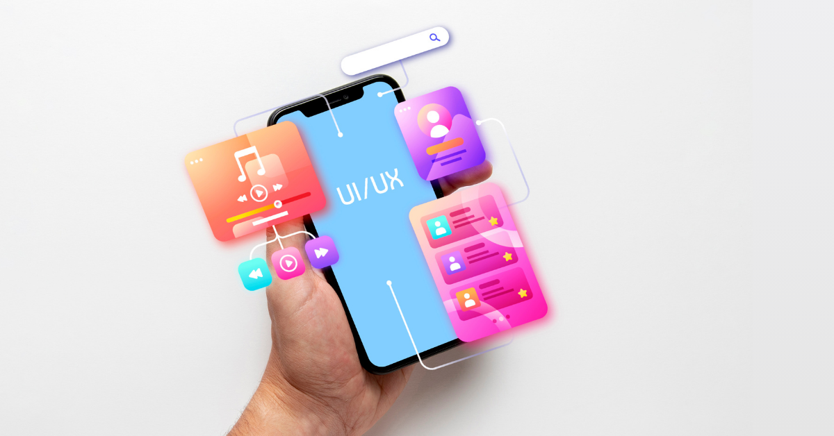
What we mean by ‘design’ in the context of a mobile application, is the user interface, i.e. what users, when they are engaging with your app, see, touch and experience on their phone or tablet screens. User interface determines the quality of the user experience and of the app as a whole; it has an impact on the number of downloads as well as, ultimately, on the overall success of the mobile application, if we may define it as such.
ORIGINAL DOES NOT MEAN COMPLICATED!
It is quite likely that you already have an idea for your app. You have a general sense of how you would like it to be. And you are certainly most concerned with wowing your users every time they use the app. Basically, you want a mobile app that is both unique and unquestionably yours, rather than the usual layout that you see everywhere else, right? To achieve this, the design is key.
Let’s make something clear right away: an overworked, colorful and out of the box design is not necessarily better than simple and thoroughly studied one. In fact, overdoing the design could confuse the user. This is why, when striving for meticulous design, it’s always better to go for something versatile. The concept of versatility is tightly linked with that of user experience (also known as UX).
You also have to keep in mind that “easy to use” does not mean “easy to design”. Quite the opposite, in fact. So when you are evaluating the cost of your app and its quality, remember that the easier it is to use, the more a higher cost is justified.

App User Experience is a Determining Factor for App Quality!
The more an interface is visually appealing, easy to use and intuitive, the more it will improve the user experience. The quality of the interaction between the users and your app is fundamental: if their experience is not great, they’ll stop using the app and they’ll eventually delete it, which is the exact opposite of what we want.
The elements that make up a good user experience
In order to understand if the user experience is good and if, therefore, the design was developed in the best way possible, we can look at different elements.
- Versatility: Users don’t have a lot of time to waste. So it wouldn’t make sense to give them an app that requires complex and contorted reasoning to figure out how it works. It’s far better to aim for intuitiveness. This applies to any type of app, whether it’s a game, an internal business app, a messaging app, or a news app, just to mention a few.
- Speed and Accuracy: The app, in addition to being easy to use, also needs to work quickly, otherwise the users are likely to get frustrated and, once again, to stop using the app altogether. Let’s put ourselves in their shoes: we are filling in a form and, for whatever reason, we switch over to another app. We come back to our form and … all our information has disappeared. This shouldn’t happen in a high quality app.
- iOS and Android designs: iOS and Android are two different platforms. If our app needs to be launched on both operating systems, we need to pay a lot of attention towards each one’s requirements from a development (and design) standpoint, in order to guarantee a great user experience. For example, the ‘back’ button only exists on an Android phone, unless one goes through a thorough and painstaking study of the navigation.
- High quality graphics: Easier said than done… In terms of interface and user experience, we can recognize a high quality app by its well-studied components and pleasing aesthetics. Unfortunately, these are qualities that are sometimes overlooked.
- Focus on detail: As we all know, details make the difference. Many different finishing touches separate a great app from the rest. A good example would be any sort of autocomplete feature. If your app has a password autofill – and it doesn’t get deleted out of nowhere – then you are on the right track towards developing a great product.


